
How Bad is the Stock Market Decline?
Stocks have been hit hard this New Year due to a combination of influences that range from sentiment to technical to fundamental. So, just how bad is it? This 26 year chart may provide some perspective.
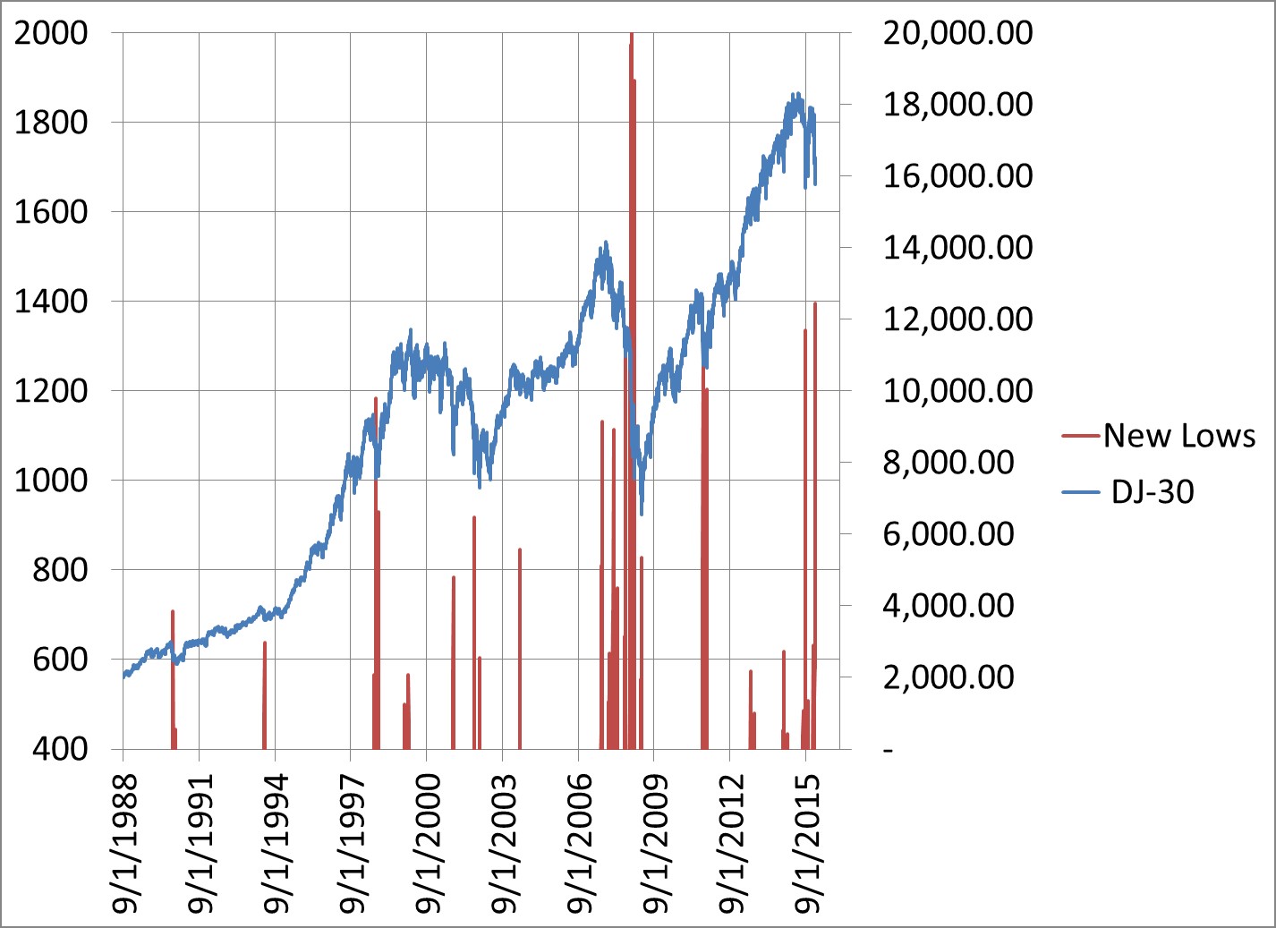
It shows the Dow Jones Industrials (blue line, right scale) and the number of NYSE stocks hitting new lows (red spikes, left scale). The scale on the left is restricted to show only the occurrences when new lows ranged between 400 and 2000. This is done to highlight the severity and potential turning times of declines.
The number of new lows is one measure of bad a sell off or bear market is. In a bear market, stocks go down. It may begin to snowball, emotions take over, and stocks get dumped with abandon. The number of new lows then spikes upward. It exceeds 400, 600, 1000. At the 2008 bear market, the number spiked to 1,894. Once it does exceed 400, there is a possibility that the selloff is over and it may be time to selectively start buying the top-rated mutual funds and ETFs and stocks. Stay with the leaders and avoid the laggards.
To be sure, there are no guarantees. The spikes show potential exhaustion in selling points. There could be a subsequent rally, but there are times when the selloff resumes with a vengeance and an even greater number of new lows are recorded.
So, right now (1/20/16) the number of NYSE new lows has spiked up to 1,395. This suggests at least a short-term capitulation on the part of sellers.
Become a member today, and see what it means to stay with the leaders and avoid the laggards with 401kSelections.com!
Please leave a comment. Remember to connect with us for future updates!

